
Ouch Learning & Development needed a new identity to replace their outdated logo and inconsistent design approach. They wanted something human and friendly, with a sense of learning and growth whilst being simple enough to roll out seamlessly across print, digital, and real-world applications.
Ouch: Brand identity & Web design
Since launching the new Ouch website, the results speak for themselves:
+71,000
USERS
VIEWS
+27,000
+286%
INCREASE IN TRAFFIC
The challenge we faced.
Ouch’s brand identity had become outdated and fragmented, with no consistent visual system in place. Their logo and materials lacked the warmth and professionalism needed to reflect their values, and the absence of a unified style made it difficult to maintain clarity across print, digital, and promotional outputs.
How we solved the problem.
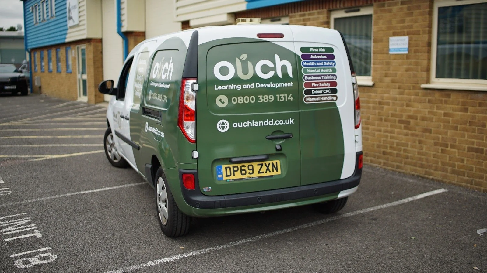
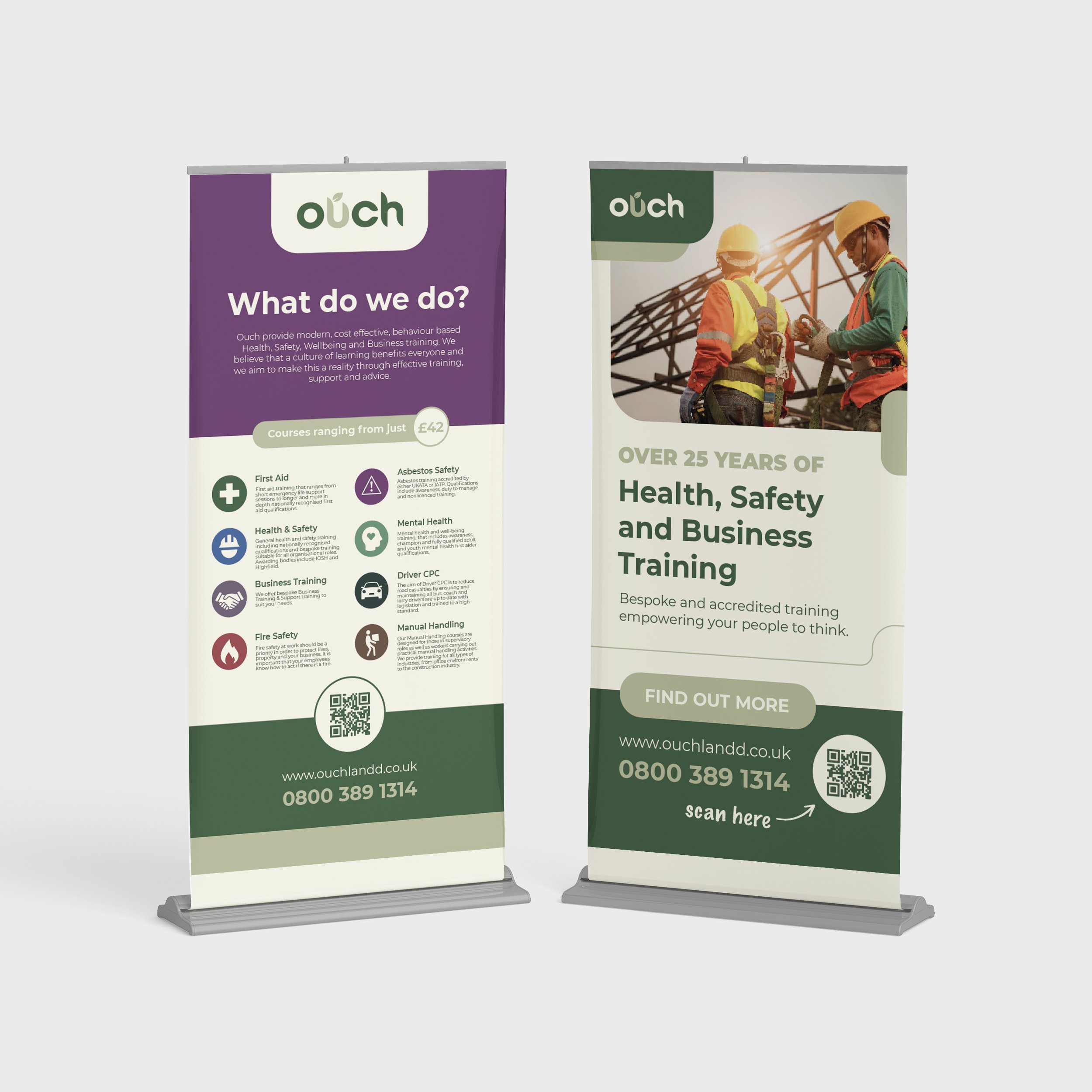
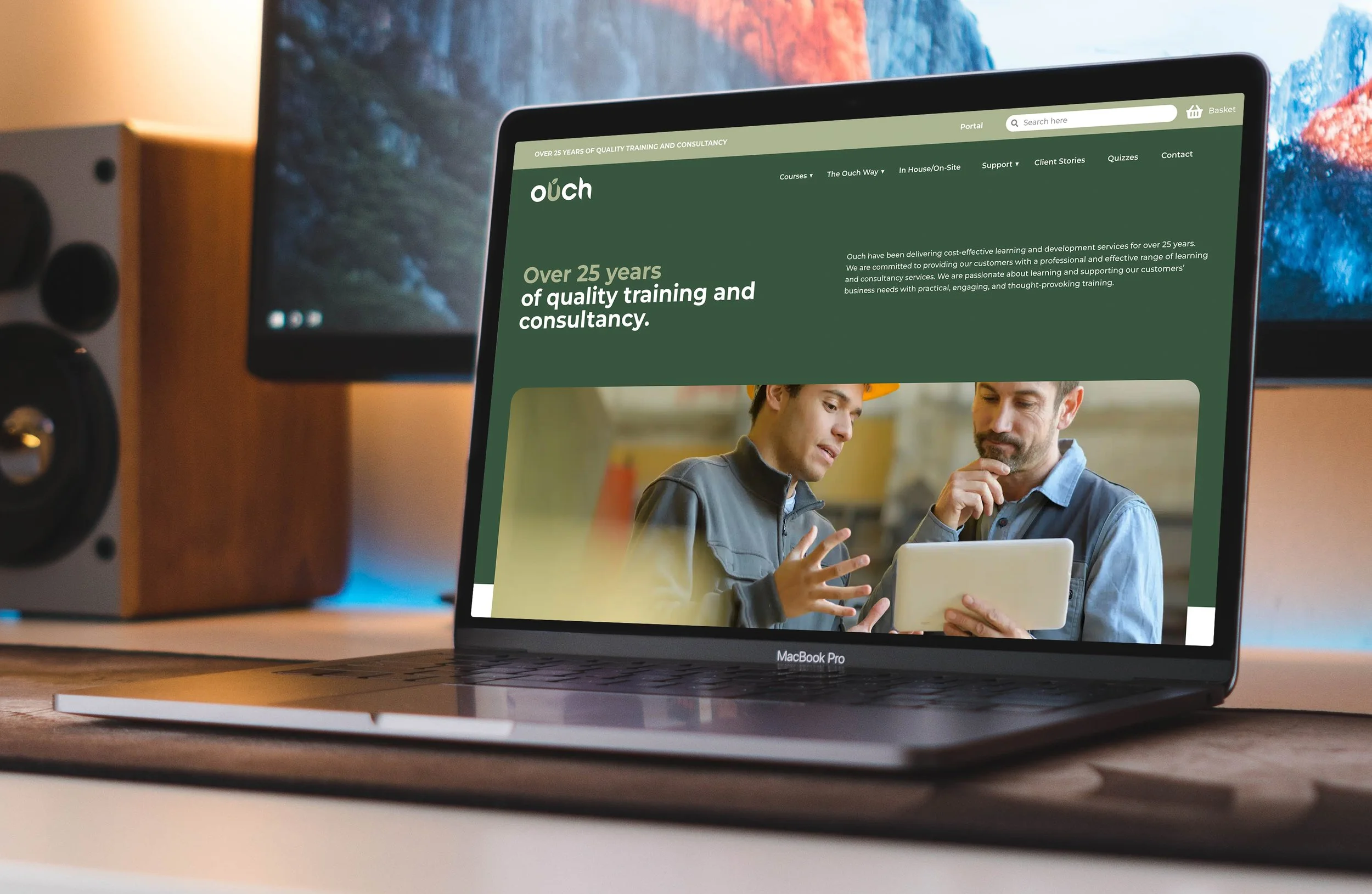
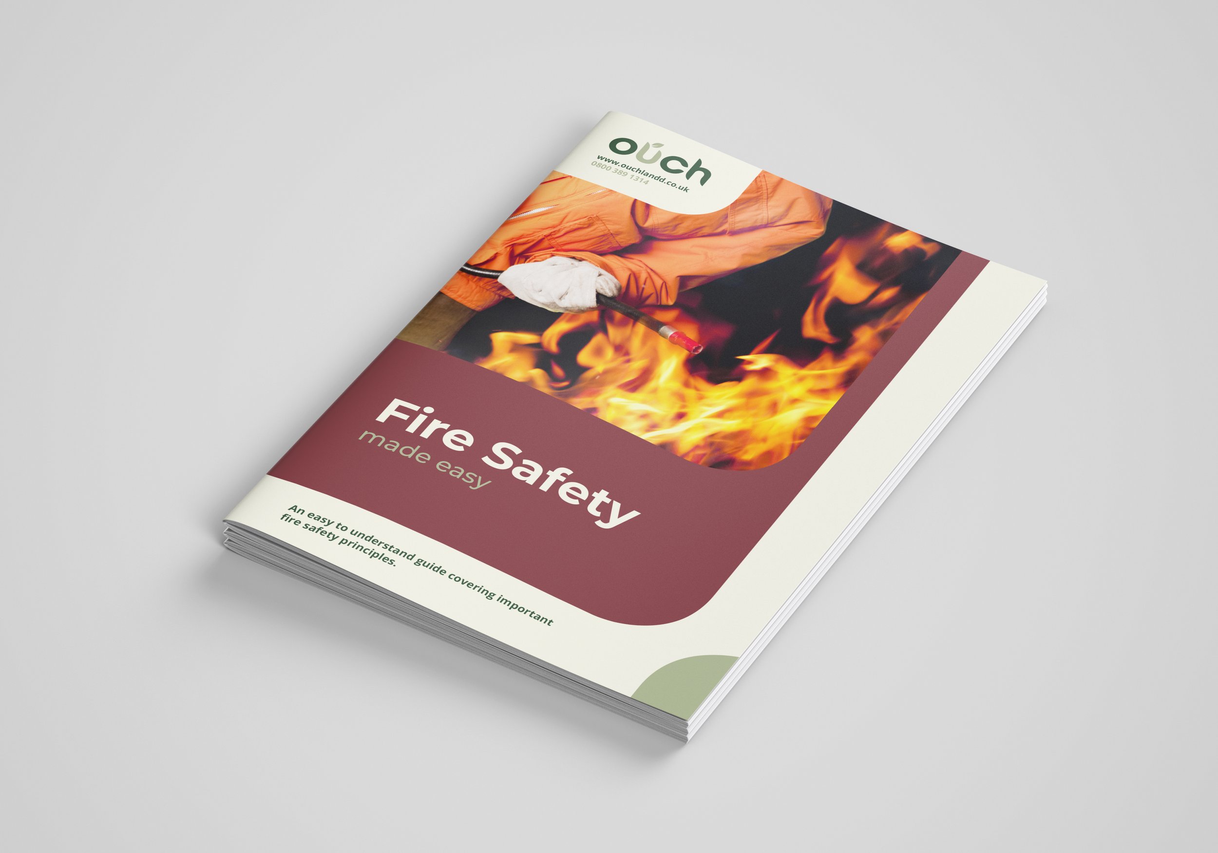
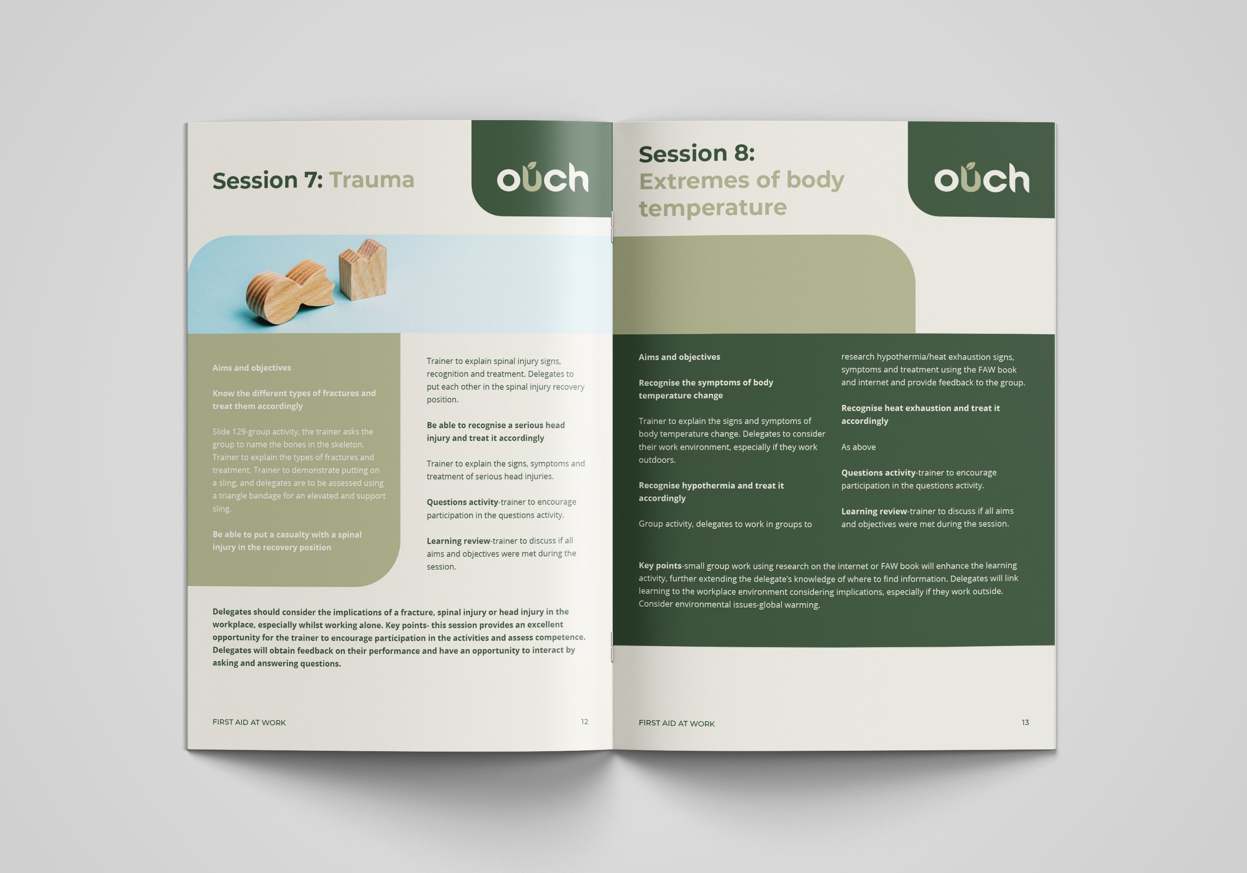
We developed a simple, versatile brand identity centred on a refreshed logo that captures the themes of learning and growth. The system was designed to feel human and approachable, while remaining bold and professional. By keeping the identity clean and flexible, it could be applied consistently across every touchpoint. From digital platforms and the website to advertising, training materials, and vehicle signage.
The new identity gave Ouch a clear and consistent visual presence that works seamlessly across digital, print, and real-world applications. From the website to large-scale adverts and branded vehicle signage, the refreshed look makes the organisation instantly recognisable and approachable. Ouch continue to return to CAS for new campaigns and materials, extending their brand identity across fresh touchpoints as they grow.
The outcome.


LETS TALK.
enquires@casdesign.co.uk
07502 143 139